Design Trend Guide
Tap into the latest packaging and product design trends shaping the future.
Our Design Trend Guide brings together materials, aesthetics and emerging
design directions to help you stay ahead of the curve.
Soft, Squishy, Sensory Design Brings Tactile Joy Into Everyday Products
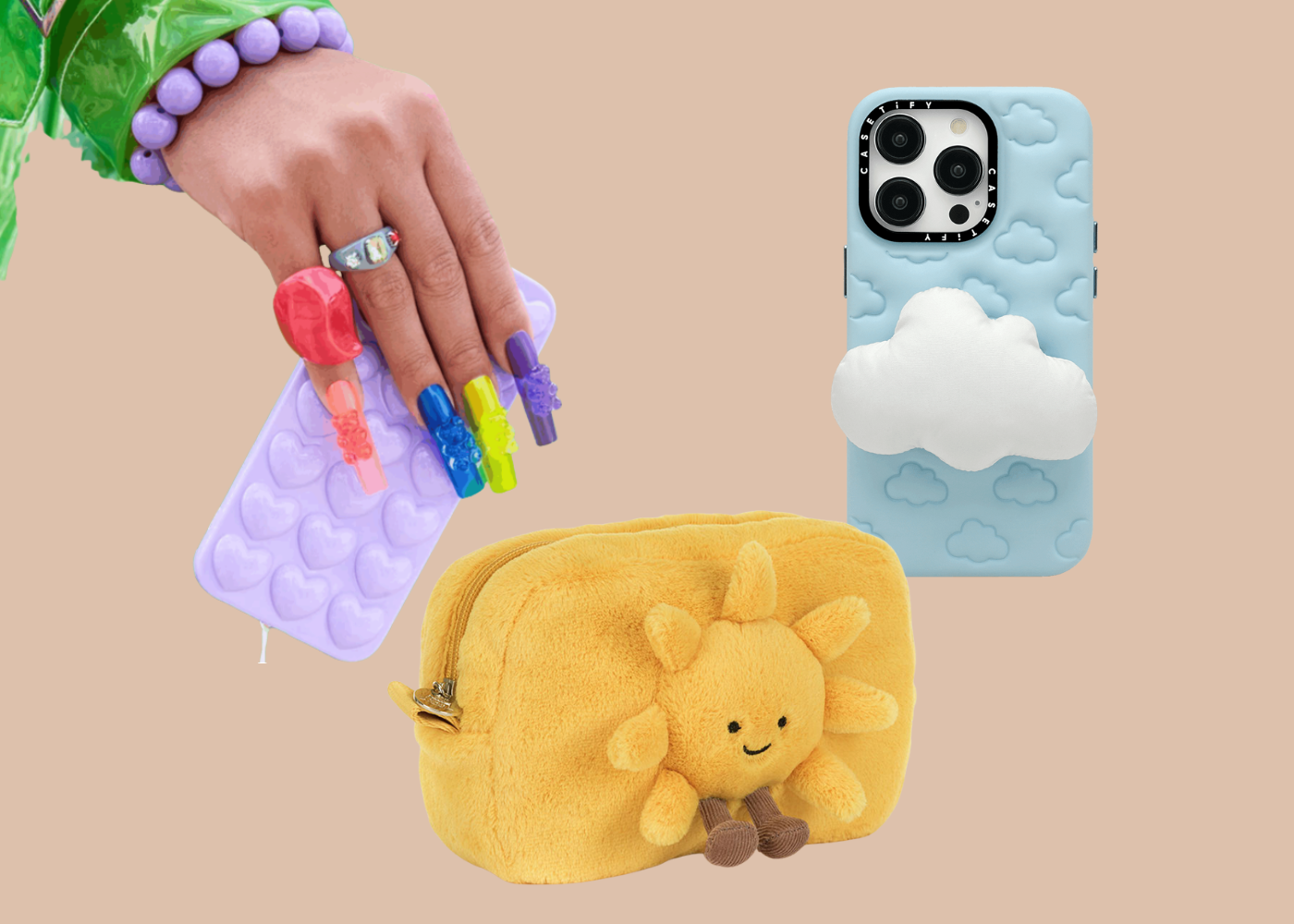
Soft, squishy, sensory-led design is emerging as one of 2026’s most defining product trends. From rubberised coatings and gummy textures to bouncy forms, translucent gels, and soft-touch finishes, these are products designed to be felt as much as they are seen. Interaction becomes the point – the squeeze, the press, the stretch, the satisfying closure. While these designs photograph well, their true appeal lies in touch, offering small, grounding moments of tactile delight.
This shift aligns closely with Pinterest Predicts 2026 “Gimme Gummy” trend, which highlights a growing appetite for texture-driven design across beauty, tech, and lifestyle categories. Squishy phone cases, jelly-like cosmetics, rubberised finishes, and stretchable formats point to a desire for products that feel playful, tangible, and sensorial – a counterbalance to increasingly digital, screen-led lives.
At its core, this movement reflects a broader cultural focus on wellbeing and mental health. Softness, nostalgia, and comfort are becoming emotional anchors rather than novelty features. Brands like Jellycat, now embraced well beyond childhood and into teen and young adult demographics, show how tactility can offer reassurance and calm. For a generation spending much of their time online, these tactile objects provide something grounding and real – slowing interaction, soothing the nervous system, and offering comfort through physical presence. They make everyday objects feel more human, considered, and emotionally resonant.
Lace, Layered, And Reimagined Turns Delicacy Into Structure
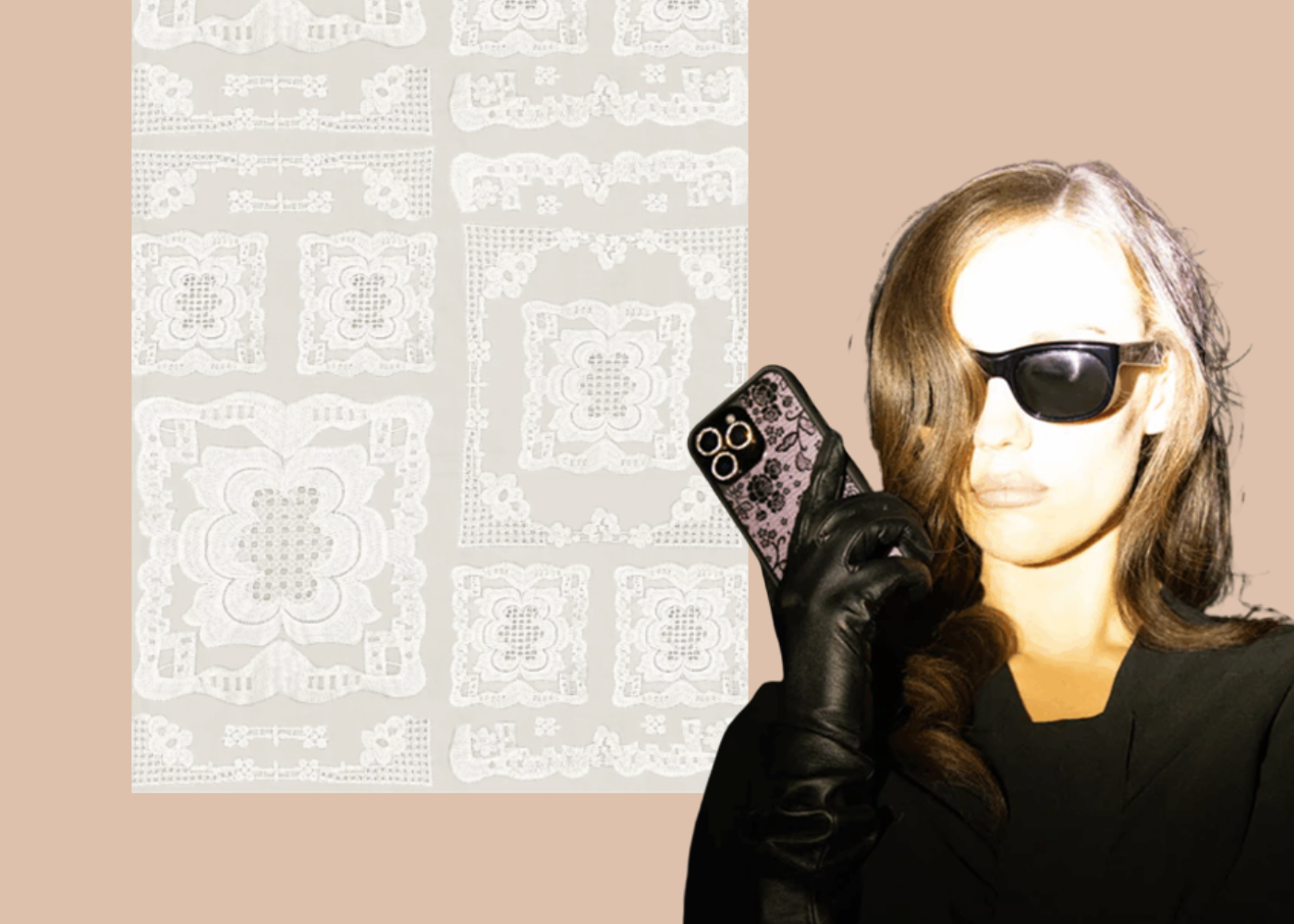
Lace is re-entering the design conversation in an unexpected way – not just as a soft textile detail, but as a structural motif translated onto hard goods. Through laser-cut patterns, moulded textures, embossed overlays, and layered perforations, lace-inspired detailing is appearing across beauty, accessories, and emerging product categories. The effect is tactile and architectural: delicate in appearance, but designed to endure.
This resurgence is strongly supported by Pinterest Predicts 2026, where lace appears as a recurring visual language across fashion and beauty. Marie Claire notes that lace has returned through a more deliberate, luxury lens, moving beyond nostalgia into considered modern expression. Once confined to garments and hosiery, lace now shows up in nail art, makeup detailing, and accessories, signalling a broader shift toward ornamental texture and romantic complexity.
What makes this trend distinctly 2026 is how it migrates beyond fashion. As highlighted by Who What Wear’s analysis of Spring 2026 runway trends influencing interiors, lace and sheer detailing are being reinterpreted through wallpaper, soft furnishings, and decorative surfaces – such as the lace-inspired wallpaper seen at Anthropologie. Once confined to garments and accessories, this ornamental language is now shaping interiors and everyday objects alike.
Lace, reimagined through modern materials and production techniques, offers a way to introduce intimacy, craftsmanship, and visual depth. It is romance with structure – softness translated into form – and a clear example of fashion-led aesthetics reshaping the future of product and packaging design.
Beautifully Broken Design Rejects Perfect Symmetry
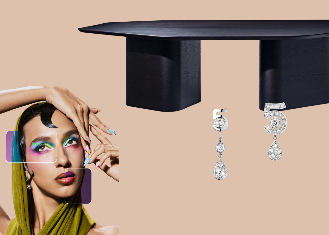
Beautifully broken design embraces deliberately “off-kilter styling”, a term highlighted by Marie Claire in its interpretation of Pinterest’s 2026 trend forecasts. Asymmetry, mismatched forms, marbled finishes, glitched textures, and irregular silhouettes are used intentionally to create tension and personality. Rather than striving for balance, these designs feel expressive, confident, and unapologetically individual.
This shift is closely tied to the rise of AI and algorithm-driven perfection. As flawless symmetry becomes effortless to generate, consumers are increasingly craving imperfection as proof of human touch. The Modems’ interpretation of the Pinterest trends reinforces this move away from hyper-polished aesthetics, pointing to a growing appetite for work that feels emotional, tactile, and slightly unresolved. The influence is especially visible in beauty, where the ‘Glitchy Glam’ trend celebrates asymmetry through two-toned makeup, mismatched nails, and bold colour blocking – a form of rebellion expressed through beauty.
The movement also extends into homewares and fashion. Pieces like Zuster’s Artistry Asymmetrical Dining Table translate this deliberately unbalanced approach into furniture, where softened edges and uneven proportions create warmth, presence, and visual interest. Even luxury brands are embracing this mindset. Chanel’s Eternal N°5 asymmetrical transformable earrings deliberately reject symmetry, pairing mismatched forms to create contrast and modern edge. When imbalance is designed with intent, it reads as character rather than flaw. Beautifully broken design signals confidence, originality, and a renewed desire for products that feel human in an increasingly automated world.
Cloud Dancer Quiet-Luxe Minimalism
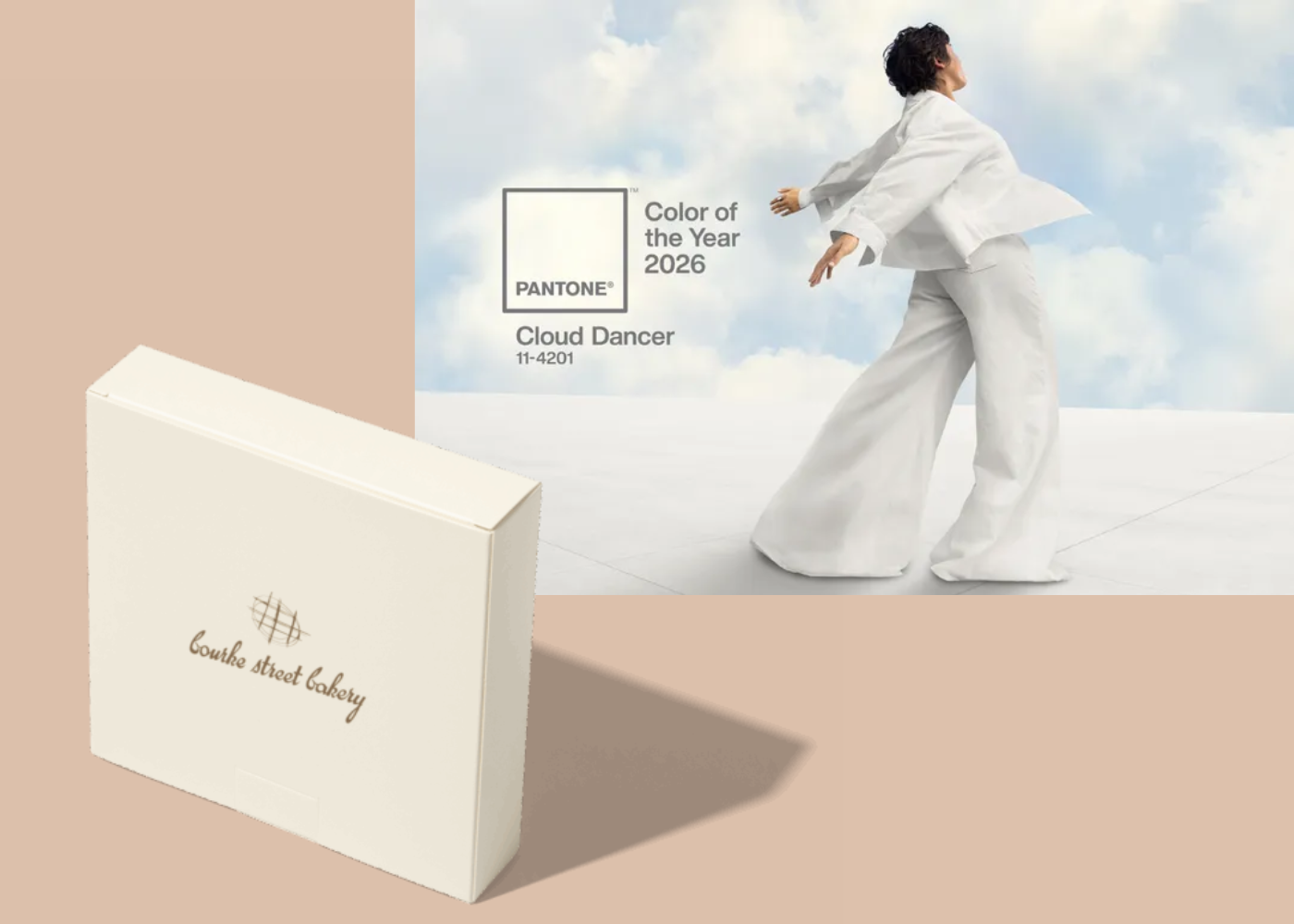
Named Pantone’s 2026 Colour of the Year, Cloud Dancer sets the tone for a new era of quiet-luxe packaging. As brands respond to a growing desire for calm, clarity, and a sense of reset, this billowy, architectural white reflects a collective shift away from excess and toward more considered design. In a world shaped by constant stimulation and digital noise, Cloud Dancer signals serenity, modern restraint, and the promise of a fresh start.
In packaging, this trend appears through tone-on-tone palettes, subtle sculptural forms, and tactile finishes that prioritise materiality over decoration. Gentle embossing, matte surfaces, and restrained typography allow the design to breathe, shifting focus from visual noise to considered detail. The renewed cultural debate around “is white a colour?” adds conceptual depth, positioning white not as absence, but as a deliberate design choice. Like a blank canvas, Cloud Dancer creates space for clarity, focus, and renewal.
We see this pared-back approach reflected in our work with Bourke Street Bakery, where minimal light cream packaging creates room for the brand to breathe -proving that restraint, when done well, can be just as expressive as colour. As brands move away from visual overload, this quiet-luxe aesthetic reflects a broader appetite for simplicity, authenticity, and thoughtful design.
Perfectly Imperfect Packaging Brings The Human Touch Back
Perfectly imperfect packaging is a deliberate move away from polished perfection and towards design that shows signs of life. In a world increasingly shaped by AI and automation, consumers are seeking reassurance that a ‘human was here’. Brands are responding by leaning into details that feel handmade, tactile, and real. Rough stamps, textured inks, fibre-rich papers, slight misalignments, and handwritten letterforms become intentional signals of craft, care, and authorship. The result is packaging that feels created, not generated.
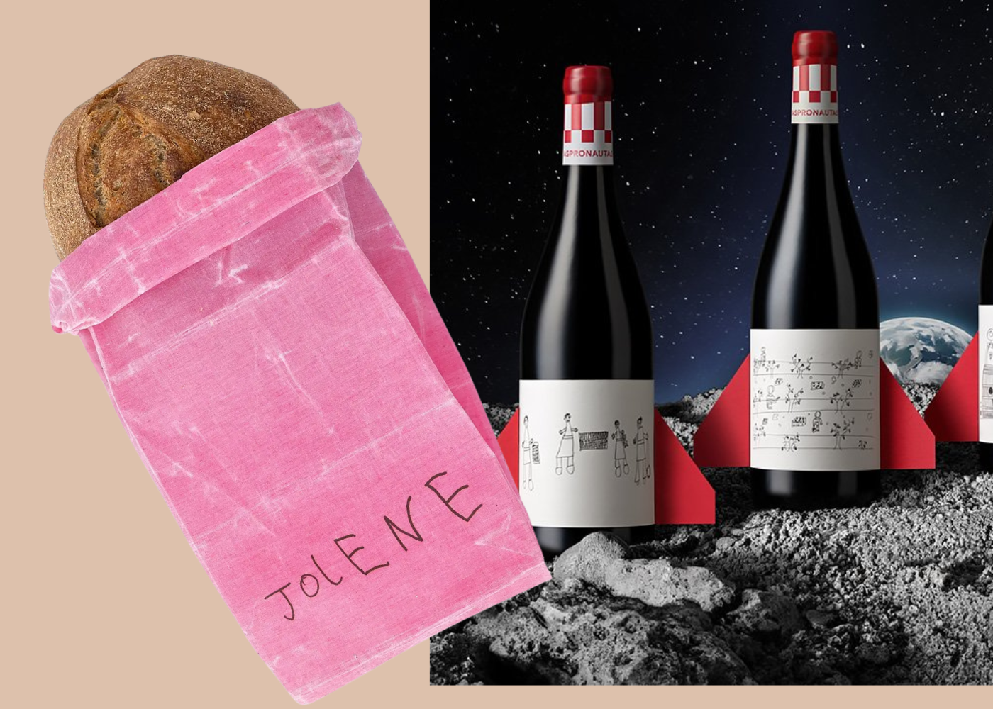
This shift echoes insights from DIELINE’s 2026 Trend Report, which identifies a growing reaction against algorithmic sameness and hyper-polished design. Even a small ‘micro-dose’ of imperfection can transform perception, making a pack feel warm, personal, and intentionally made. A compelling example is London’s Jolene Bakery, where the logo was drawn by the six-year-old son of the designer at Studio Frith. That unpolished, hand-drawn quality gives the packaging a sense of connection and personality that slick digital design cannot replicate. We see a similar approach in Pablo Guerrero’s Aspronautas wine labels, where each bottle features a unique hand-drawing by the winemakers themselves. These subtle, human marks
Big, Bold, Beautiful Type Takes Centre Stage
Big, bold typography is stepping into the spotlight, with letterforms becoming the primary visual driver of packaging design. Oversized wordmarks, cropped layouts, and edge-to-edge type are replacing imagery, allowing brands to communicate with clarity, confidence, and immediate shelf impact. When the message is unmistakable, the pack becomes harder to ignore.
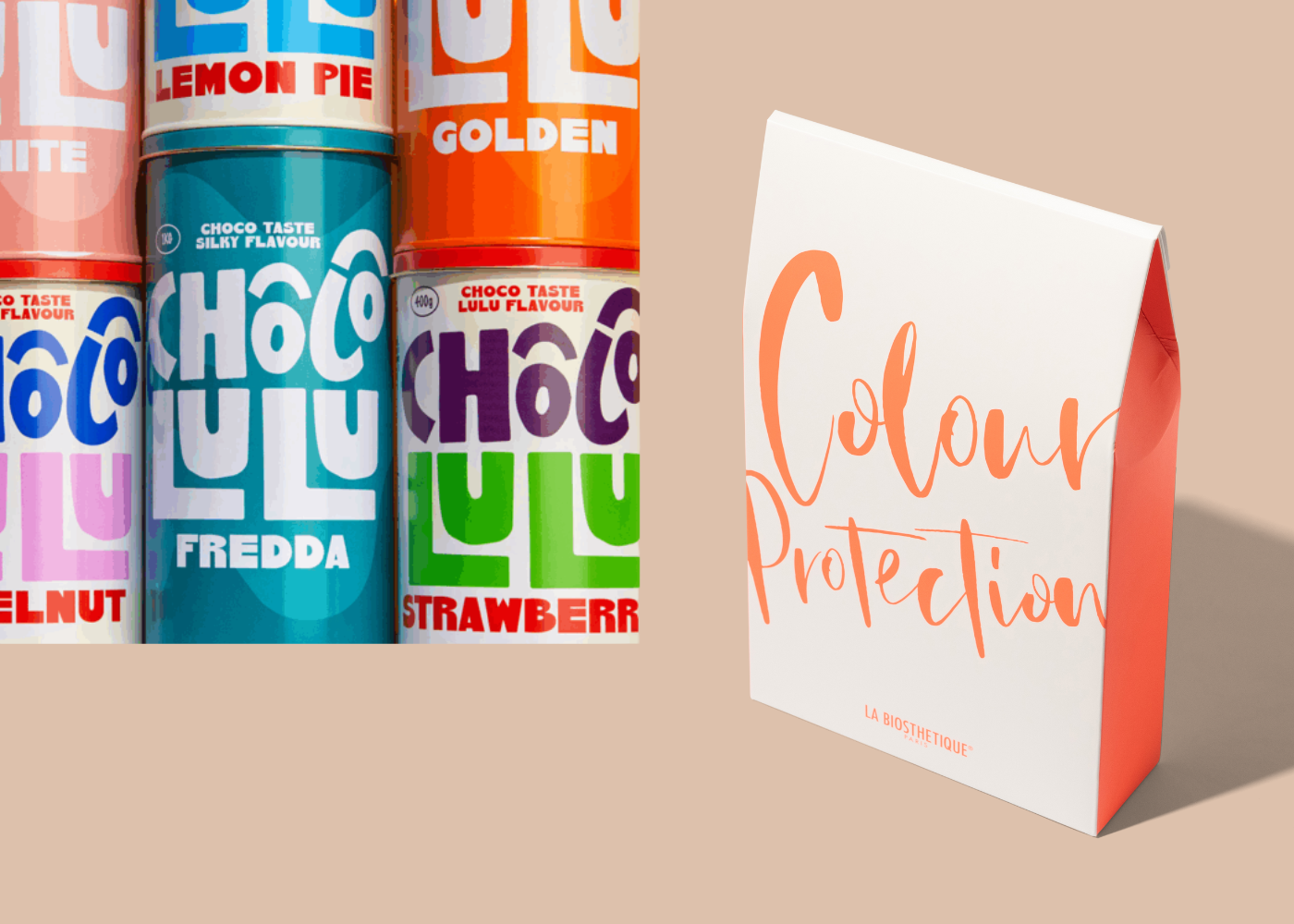
This shift aligns with recent Pentawards trend insights, which highlight ‘Upfront Font’ as a key movement across food and beauty categories. Here, typography is no longer decorative support but the brand itself, carrying tone, personality, and intent in a single visual gesture. Designs such as AG Design Agency’s Chocolulu demonstrate how oversized type and a strong name can do the heavy lifting, creating packaging that feels bold yet approachable, memorable yet simple.
We see a similar approach in our work with La Biosthétique, where confident lettering leads the design while restraint in colour, spacing, and material choice preserves refinement. In fast-scroll, shelf-first environments, typography-led packaging cuts through visual noise quickly and decisively. It proves that when type is considered, expressive, and well-resolved, it can communicate more powerfully than imagery alone.