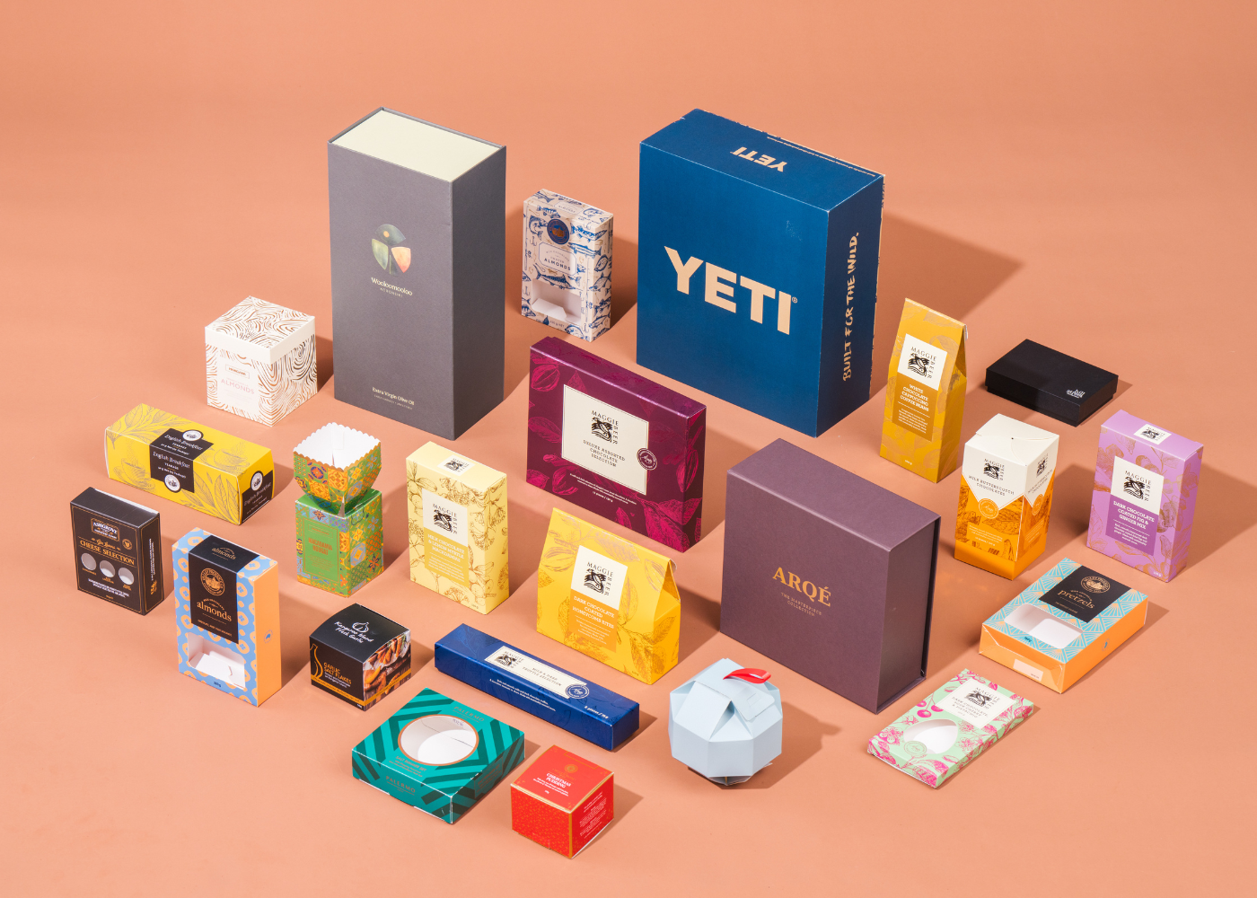
In today’s crowded retail environment, customers make decisions quickly. Most shoppers spend only a few seconds scanning a shelf before moving on. For this reason, packaging design for shelf impact has become a critical commercial advantage. Products that stand out are more likely to be picked up, considered and purchased, while packaging that blends in risks being overlooked.
Shelf impact is about more than visual appeal alone. It is the result of clarity, structure, colour, storytelling and material choice working together. When these elements align, packaging helps customers understand what they are buying, why it matters and what level of quality to expect. This clarity builds confidence and encourages further engagement.
Strong shelf impact also helps brands communicate value instantly. In competitive categories, this immediate understanding can be the difference between being noticed or ignored. Well-considered packaging reduces friction in the buying process and supports faster, more confident decisions.
At Nextpack, we see this play out daily across beauty, lifestyle, food and beverage, gifting, petware and retail categories. Shelf impact is never guesswork. It is a deliberate design outcome shaped through research, strategy and thoughtful execution. In the sections that follow, we explore how to achieve shelf impact through packaging design that stands out for the right reasons.

1. Understand your customer before you design
Packaging design for shelf impact begins with a clear understanding of who your customer is and how they shop. Different audiences respond to different cues, and recognising these differences early leads to stronger design decisions. Younger customers may be drawn to colour, personality and visual expression, while gift buyers often respond to refinement, tactility and a sense of occasion. In more practical categories, clarity, structure and ease of use tend to matter most.
For this reason, market research plays a critical role in the design process. It helps uncover behaviours, expectations and values that influence purchasing decisions. Reviewing motivations, common frustrations and decision drivers provides valuable context before any creative work begins. Observing how customers browse in-store and online also reveals what captures attention and what gets overlooked on shelf.
Internal insights are just as important. Short conversations within your business often surface patterns that external research may miss. Sales teams understand buying hesitations, while customer service teams hear recurring questions and feedback. Together, these insights help define what your packaging must communicate immediately, especially in the first few seconds at shelf.
Here at Nextpack, this discovery phase shapes every project we take on. Before anything is sketched or sampled, we clarify who the packaging needs to speak to and what must be understood almost instantly. This ensures every structural, material and graphic decision is purposeful rather than decorative.
To learn how this insight-led approach translates into clear design direction, check out this resource article: Spotting Opportunities: How to Identify Market Gaps and Outshine Competitors.
2. Lead with clarity and simplicity
Shelf impact does not come from complexity. It comes from clarity. Customers want quick answers and immediate reassurance, not the effort of decoding what is in front of them. For this reason, packaging should guide the eye naturally and with ease.
Clear product names, concise descriptors and visible benefits help customers recognise value at a glance. When information is presented clearly, shoppers can scan shelves faster and compare options without friction. As a result, packaging that feels simple and organised often appears more confident and considered than packaging that tries to say everything at once.
Clarity is also a form of respect for the customer. It supports informed decision-making and reduces hesitation at shelf. Long paragraphs and overcrowded layouts are best avoided on primary panels. Instead, prioritise essential information first, then support it across secondary panels where customers can explore further detail if they choose.
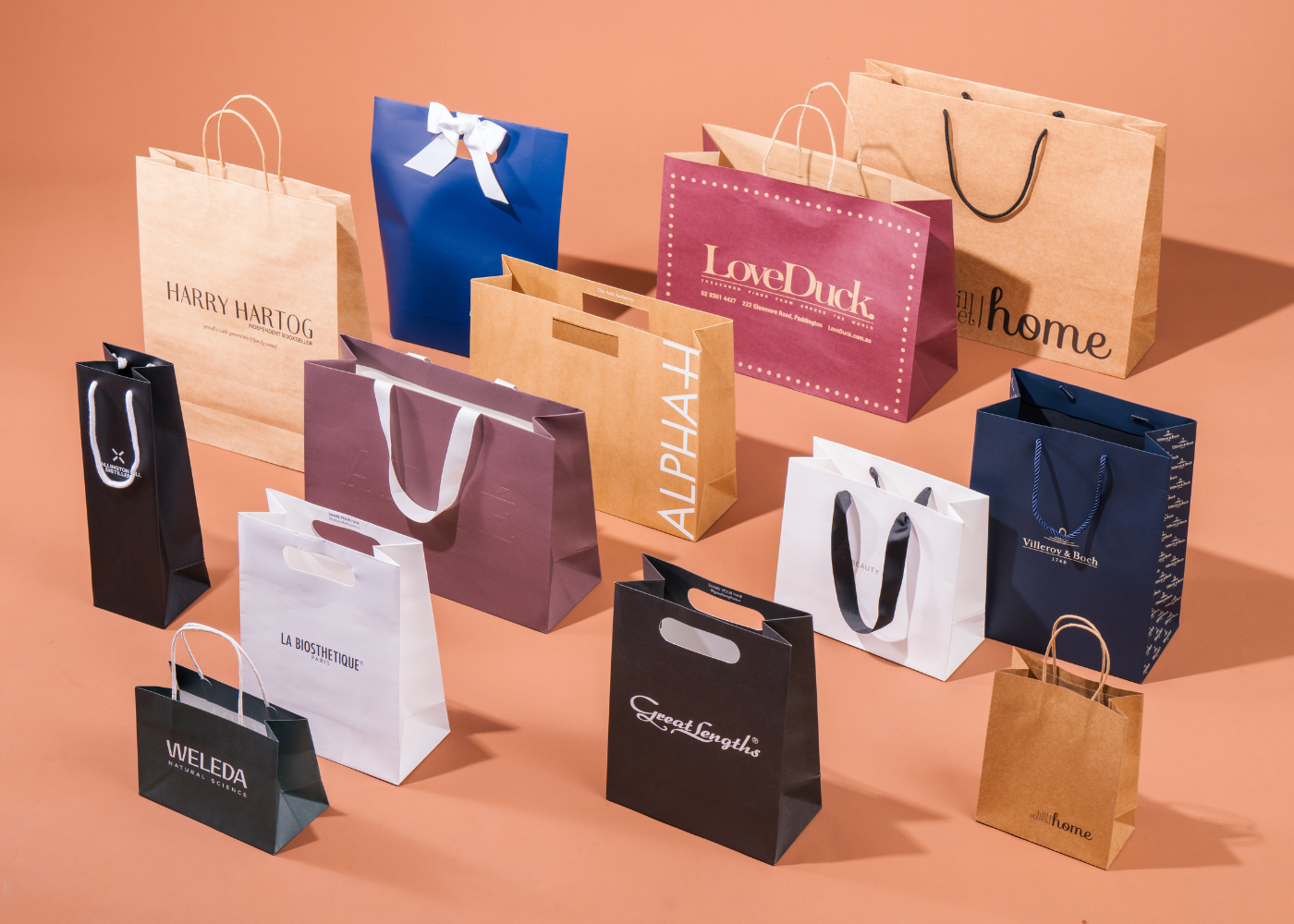
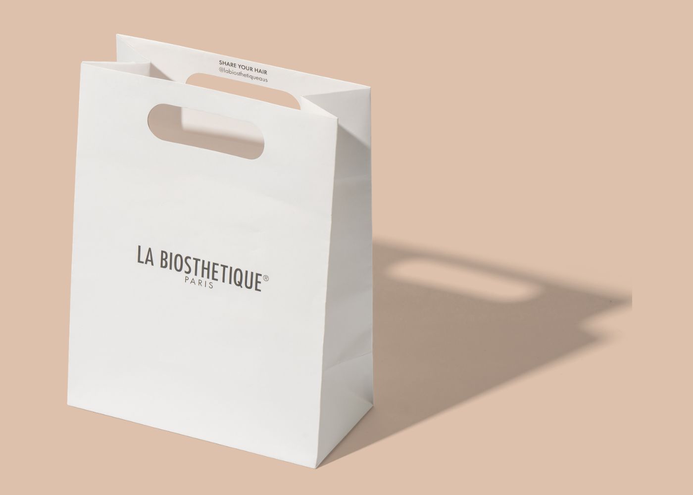
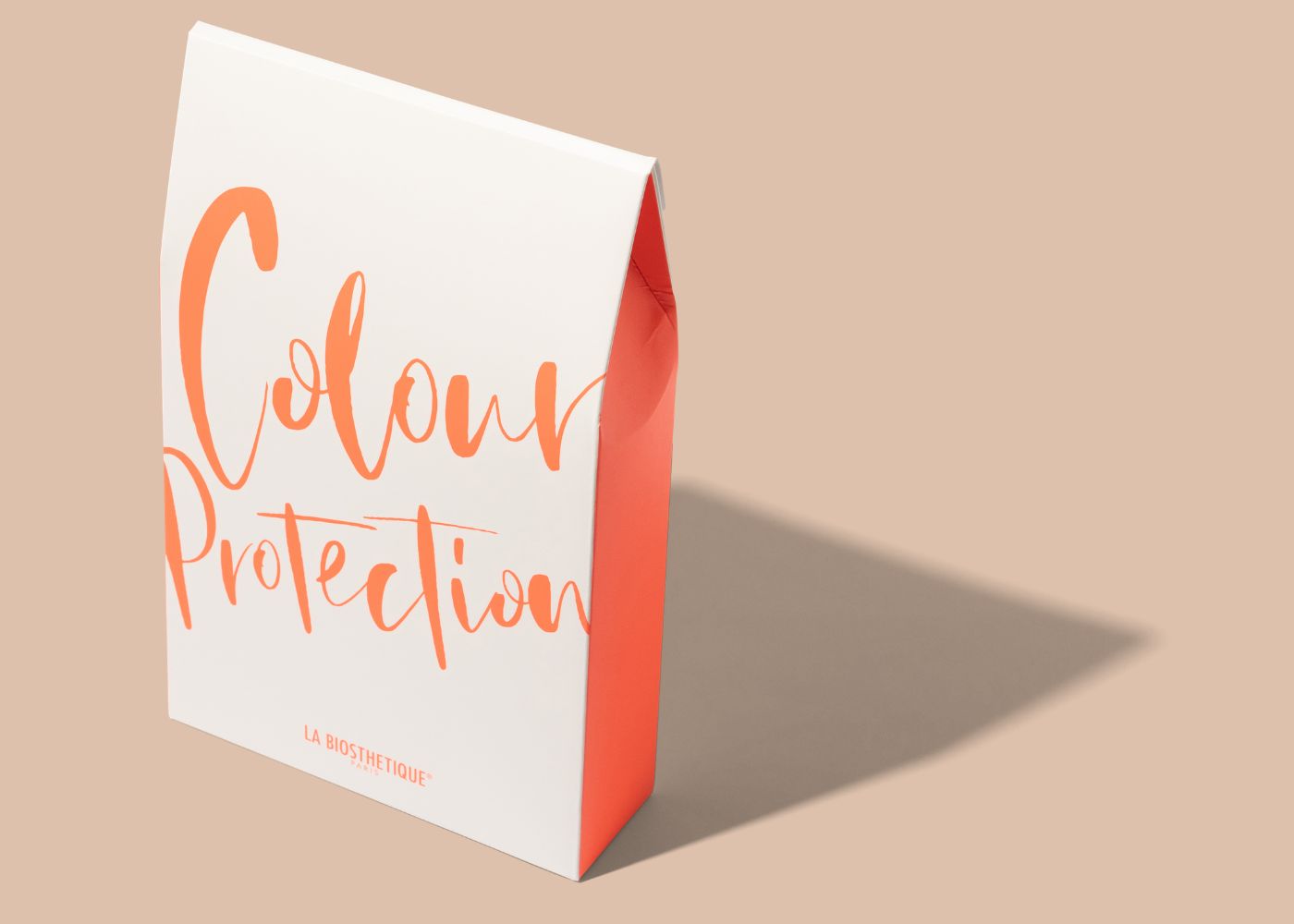
This approach is evident in our work for La Biosthétique, where simplicity was used as a strategic tool as well as a stylistic choice. Clean typography, generous white space and restrained messaging allow the brand name to take centre stage, creating immediate clarity and a premium shelf presence without distraction.
Over time, this level of clarity also supports range expansion. Once a strong communication hierarchy is established, new products can be introduced without disrupting recognition, ensuring the range feels cohesive and well considered.
3. Use colour with intention
Colour is one of the most powerful tools in packaging design for shelf impact. It attracts attention, communicates emotion and signals category within seconds. In crowded retail environments, contrast can pull a product forward on shelf, while tonal harmony can express restraint, confidence and sophistication.
Successful colour use relies on intention. Colour should never be chosen for aesthetics alone. Instead, it should reflect brand personality, category logic and customer expectations. When colour decisions are strategic, they help customers quickly understand where a product sits and whether it aligns with their needs.
In premium categories, restrained palettes often communicate quality and craft. In everyday categories, brighter colours may express freshness or functionality. Gifting ranges frequently lean into richer hues to signal generosity and occasion. Knowing when to apply restraint versus contrast is essential.
Contrast also plays a practical role. A contrasting colour behind a logo, product name or key benefit improves readability and speeds comprehension, even when customers are scanning shelves quickly.
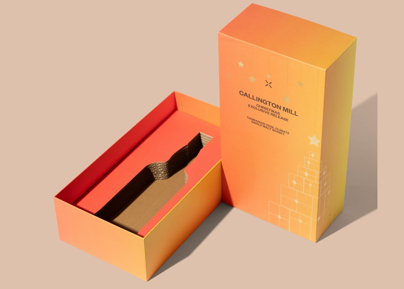
This approach is evident in our work for Callington Mill Distillery, where bold colour was used deliberately to create strong shelf presence while maintaining a refined brand aesthetic. The palette clearly differentiates the product while still feeling premium and considered.
To explore how colour works alongside typography and texture, you may enjoy reading Three Powerful Design Elements – The Power of Fonts, Colours, and Textures in Packaging Design, which examines how these elements shape perception and purchasing decisions.
Finally, shelf testing remains essential. Placing mock-ups alongside competitors reveals which colour choices stand out, feel category-aligned or need refinement before production.
4. Treat typography as a key strategic element
Typography carries tone, clarity and authority. It shapes how customers judge a product before they ever touch it. In packaging design for shelf impact, typography must do more than look good. It needs to communicate clearly, reinforce brand personality and support fast decision-making at shelf.
Different type styles send different signals. Bold, geometric typefaces often feel modern and confident, making them well suited to contemporary or design-led brands. Serif typefaces may communicate craftsmanship or heritage, while softer, rounded styles can feel calm and approachable. Choosing the right typeface helps customers intuitively understand a brand’s positioning within seconds.
Hierarchy is essential. Size, weight and spacing should be used deliberately to guide the eye and prioritise information, ensuring the most important message is the most visible. Testing plays a critical role here. Some fonts appear sharp on screen but lose clarity when printed, particularly on textured stocks or specialty materials.
As noted earlier, typography works best when considered alongside colour and texture. Together, these elements shape perception and emotional response. For a deeper look at how they interact, Three Powerful Design Elements – The Power of Fonts, Colours, and Textures in Packaging Design offers further insight into typography’s role in influencing consumer behaviour.
Finally, typography should be chosen with longevity in mind. Consider how it will perform across labels, cartons, swing tags and shippers. When type works consistently across formats, it strengthens recognition, builds trust and reinforces shelf presence over time.
5. Consider structure, shape and physical form
Shelf impact is not only visual. It is also physical. Structural packaging design plays a critical role in how a product behaves on shelf and how it is perceived before it is touched. Unique shapes, subtle curves, recessed panels or custom closures can capture attention, even when graphic design is intentionally restrained.
A distinctive structure can signal premium value immediately. At the same time, it can enhance usability. Features such as resealable closures, integrated handles and reinforced edges improve the customer experience while also supporting practical handling in retail environments.
Retail considerations are equally important. Packaging must stand securely, stack efficiently, face forward consistently and withstand frequent handling. If a structure collapses easily or displays poorly, it undermines shelf presence, regardless of how refined the design may appear in isolation.
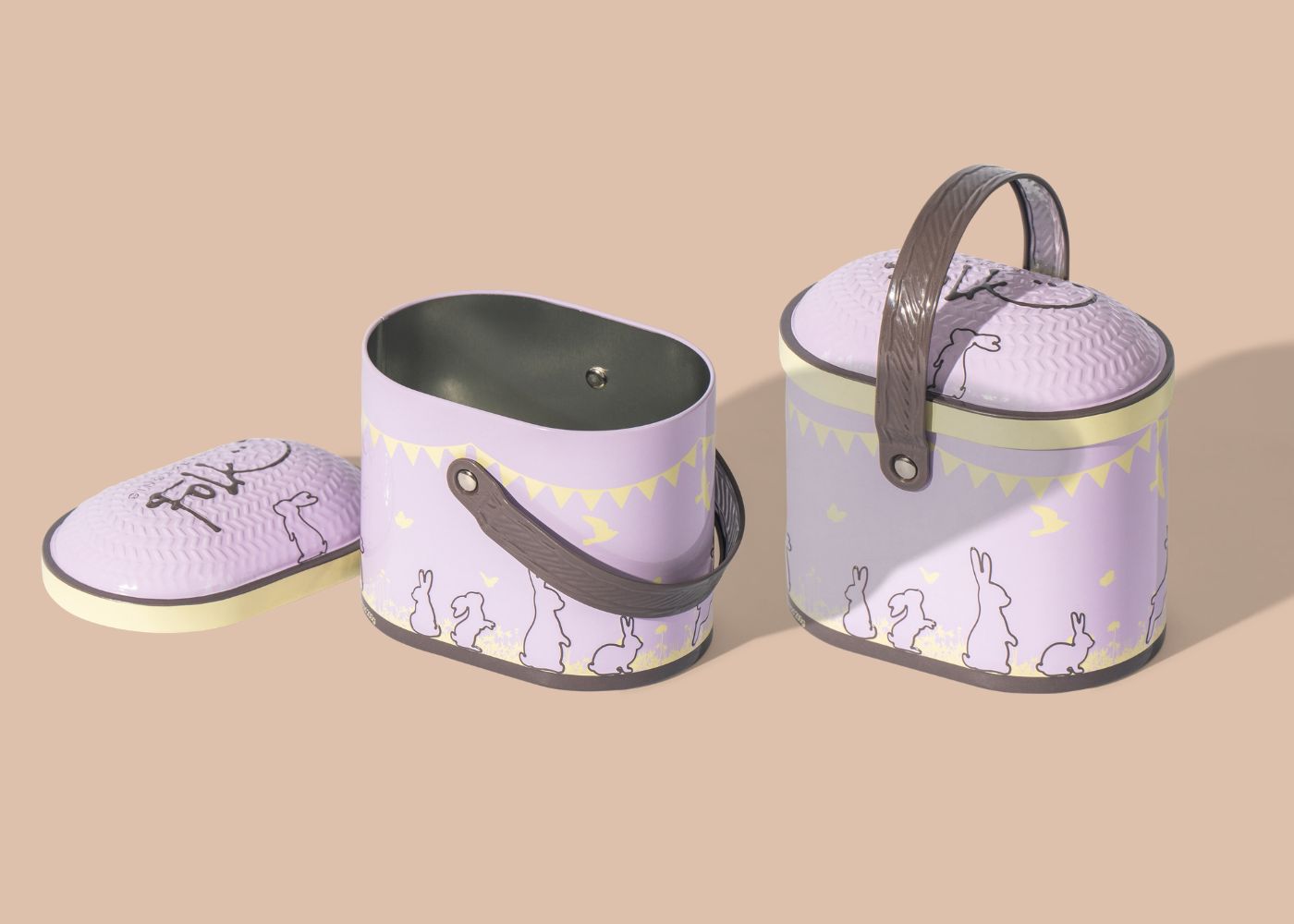
A strong example of structure-led shelf impact can be seen in our work with Gingerbread Folk. Their seasonal Easter tin needed to stand out while still feeling whimsical and giftable. By designing a reusable keepsake tin with a basket-like silhouette, we created shelf presence that felt charming, memorable and purpose-driven. In this case, structure became part of the story, contributing significantly to both visual appeal and perceived value. You can explore this project further in our Gingerbread Folk case study.
6. Use materials and finishes that communicate quality
The materials you choose influence perception instantly. Because customers often touch packaging before they read it, the substrate becomes part of the brand story. Premium materials add weight, structure and confidence, while soft textures, precise edges and considered details communicate value without explanation.
Finishes further elevate this experience. Foiling, embossing and soft-touch coatings interact with light and touch to invite closer inspection and encourage engagement. When used with restraint, these finishes reinforce quality cues and enhance shelf presence without feeling excessive.
Responsibility also plays an increasingly important role in material selection. Many customers now expect sustainable choices as a baseline. Recyclable boards, vegetable-based inks and biodegradable coatings allow brands to meet these expectations while maintaining a refined, premium aesthetic.
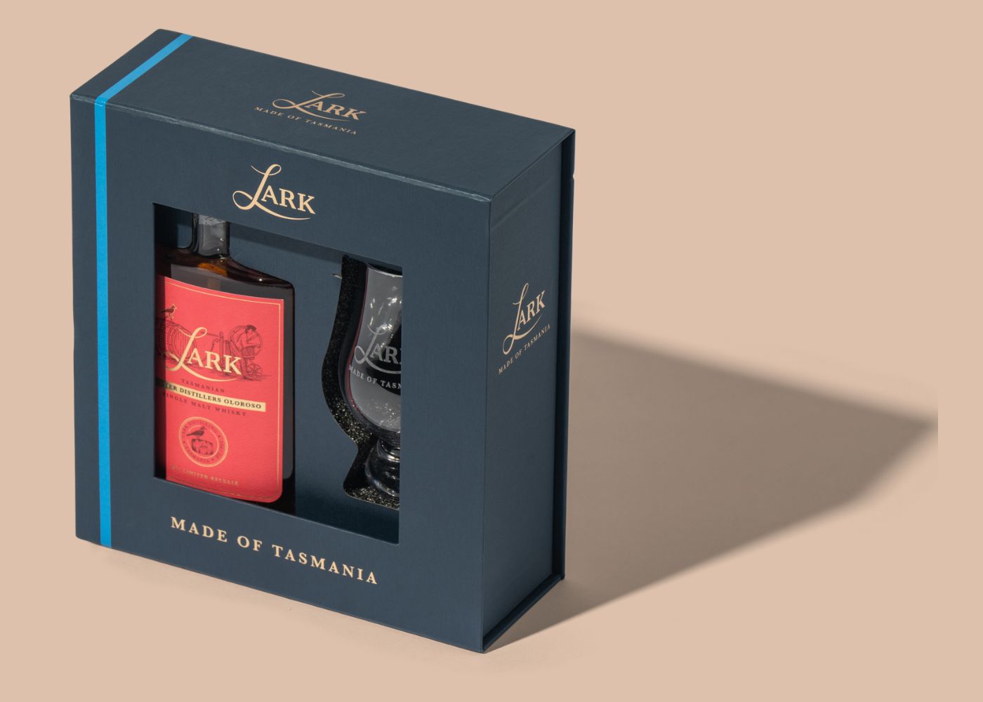
This balance is evident in our work with Lark Distillery. The brief called for a high-end, tamper-proof window box that provided transport protection, retail friendliness and strong brand presence. Using 70% recycled board, a fine-texture stock and a considered combination of cyan and gold foiling, we created packaging that delivers both protection and shelf impact while reinforcing the craftsmanship and quality of the whisky inside.
You can explore this project in more detail in our Lark Distillery case study, which outlines how material choice, finish and structure work together to create a premium retail-ready solution.
7. Build shelf impact through storytelling
Storytelling is one of the most powerful tools in packaging design. It helps customers form an emotional connection and understand value beyond the product itself. The story may be subtle or expressive, but it should always feel authentic to the brand and appropriate for the category.
Stories can be communicated in many ways. Illustrations, symbols, tone, structure and small written details all play a role. Even a single line of text or a considered visual cue can shape perception. What matters most is that the story feels genuine and enhances the moment of discovery when a customer first encounters the product on shelf.
A well-told story also supports recall. When customers remember something distinctive about the packaging, whether it is a visual element, a material choice or a thoughtful detail, the product is more likely to stay top of mind long after purchase. Over time, this recognition strengthens brand affinity and repeat consideration.
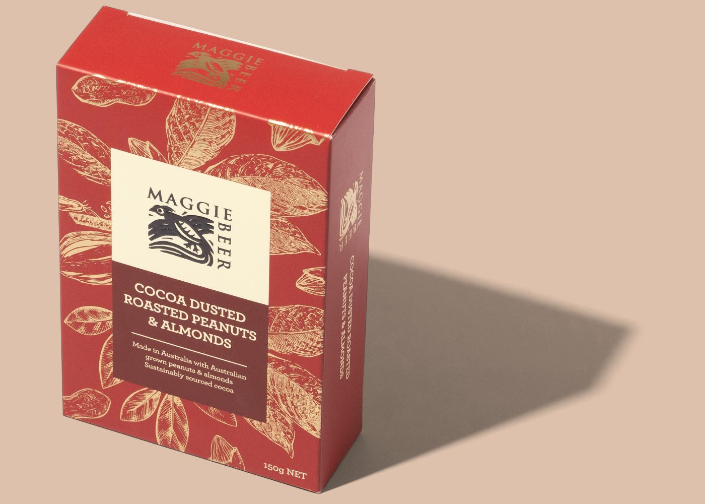
Our work for Maggie Beer illustrates this approach in action. Rather than relying on overt messaging, the story is expressed through earthy tones, botanical illustrations and a refined, considered structure that reflects the richness of the product inside. Subtle written details reinforce provenance and quality, creating a sense of indulgence and care that feels unmistakably on brand. Together, these elements create emotional connection at shelf and leave a lasting impression beyond the first encounter.
8. Maintain brand consistency across every touchpoint
Shelf impact becomes stronger when a brand feels cohesive across its entire range. Consistency helps customers recognise your product quickly and builds trust over time. When packaging looks unified, customers feel more confident that the product will deliver a reliable and considered experience.
Consistent use of colour palettes, materials, typography, iconography and tone creates a clear visual language. While these elements can be adapted across formats and product types, they should always share a recognisable throughline. This allows customers to identify the brand instantly, even from a distance.
Consistency does not limit creativity. Instead, it provides a framework for thoughtful variation. New products can be introduced without disrupting shelf presence, while seasonal or limited editions can still feel connected to the wider range.
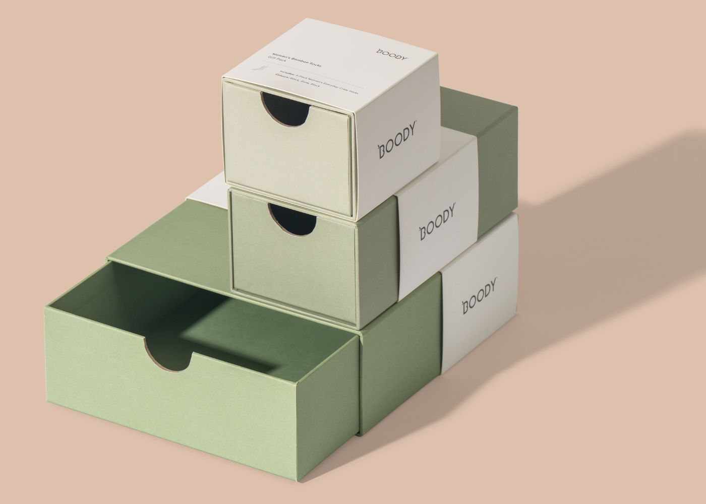
This approach is evident in our work for Boody, where we designed packaging that remains clean, restrained and aligned with the brand’s values across multiple categories. Through consistent typography, considered material choices and a refined visual system, the packaging creates a recognisable shelf presence while reinforcing trust and brand clarity.
Over time, consistency across every touchpoint strengthens shelf impact and supports long-term brand equity, helping the brand feel familiar, dependable and well considered wherever it appears.

9. Test, learn and refine before launch
Prototyping and testing are essential steps in packaging design for shelf impact. A concept that looks strong on screen can behave very differently in the real world. For this reason, testing should extend beyond digital visuals. Physical samples reveal how packaging sits on shelf, how it is handled, how it opens and how it performs in real retail environments.
Where possible, samples should be reviewed in-store. Observing how packaging stands, stacks and faces forward helps assess both visibility and usability. It also highlights how the product competes alongside neighbouring brands and whether customers can interact with it easily.
Customer feedback adds further clarity. Asking what people notice first, what they understand immediately and what feels unclear helps identify gaps in communication. These insights allow designers to refine structure, materials or messaging so the final result performs both visually and functionally.
Iteration is a sign of care, not indecision. Each refinement strengthens the outcome, reduces risk and supports a more confident product launch. To see how testing and refinement fit within a broader end-to-end process, you may enjoy reading Transforming Ideas into Reality: Nextpack’s Process for Packaging and Product Design, which outlines how concepts move from briefing and prototyping through to production and delivery.
Conclusion
Achieving strong shelf impact is a powerful way to increase visibility, drive sales and communicate value. It requires clarity, structure, colour, typography, materials and storytelling to work together with intention. When these elements are aligned, packaging becomes more than a container. It becomes an experience that invites customers to engage with the product and choose it with confidence.
At Nextpack, this balance of beauty and practicality sits at the centre of our work. We design packaging systems that feel refined, perform reliably and connect meaningfully with customers in real retail environments. Whether you are refreshing a single product or developing a complete range, thoughtful packaging design for shelf impact can help your brand stand out for the right reasons.
If you’re curious about what this level of care feels like in practice, The Nextpack Effect: What Product and Packaging Design Feels Like When It’s Done Well offers a deeper look at how considered decisions translate into real-world outcomes across product and packaging design.
If you are considering a packaging refresh or would like to understand how this process feels from concept through to production, our team would be pleased to support you. Together, we can create packaging that stands out on shelf, feels considered in the hand and elevates your brand with purpose.
