At Nextpack, we know that packaging isn’t just a protective shell for your product—it’s a powerful tool that influences a buyer’s emotions, behaviour, and decisions.
Furthermore, a well-crafted design builds emotional connections, fostering trust and driving purchases. At the heart of this impact are three powerful design elements: fonts, colours, and textures.
In this article, we’ll dive into how these three powerful design elements shape consumer feelings and behaviours, and why your business needs to consider these key factors throughout your packaging design.
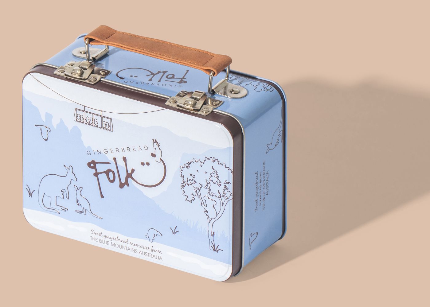
1. Fonts: The Silent Communicator
The typography on your packaging can say more than just words — it conveys your brand’s personality, values, and the quality of your product. The right font affects how customers perceive your brand from the first glance.
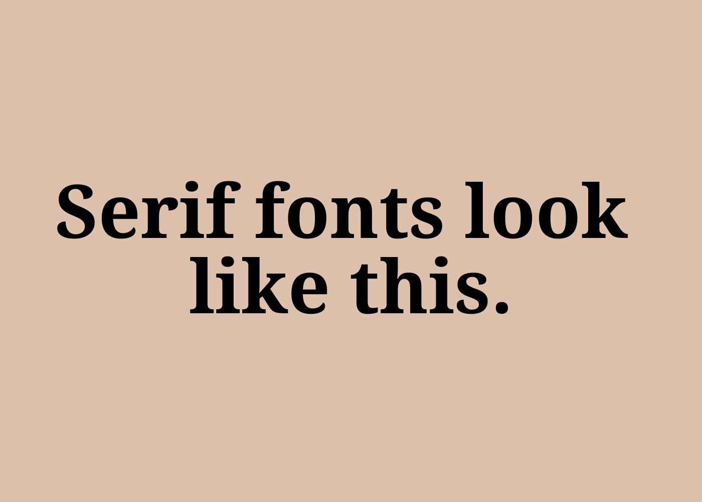
Serif Fonts: Traditional & Trustworthy
Serif fonts (those with little “feet” or strokes at the ends of letters) are often associated with tradition, reliability, and sophistication. As a result, brands evoking heritage or long-standing reputations, like luxury goods, should opt for serif fonts. Think of brands like Tiffany & Co. or Rolex—they use serif fonts to build a sense of legacy and trust.
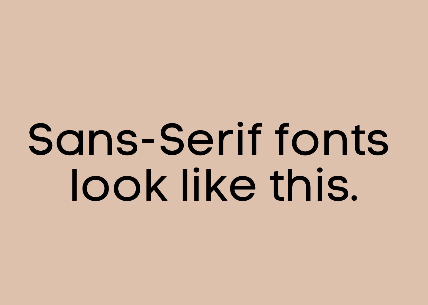
Sans-Serif Fonts: Modern & Clean
Sans-serif fonts, on the other hand, are clean, modern, and minimalistic. Additionally, they tend to work well for tech, health, and wellness brands that want to convey simplicity, innovation, and forward-thinking values. Apple and Nike use sans-serif fonts to push the boundaries of modernity and innovation, leaving a sleek, confident impression.
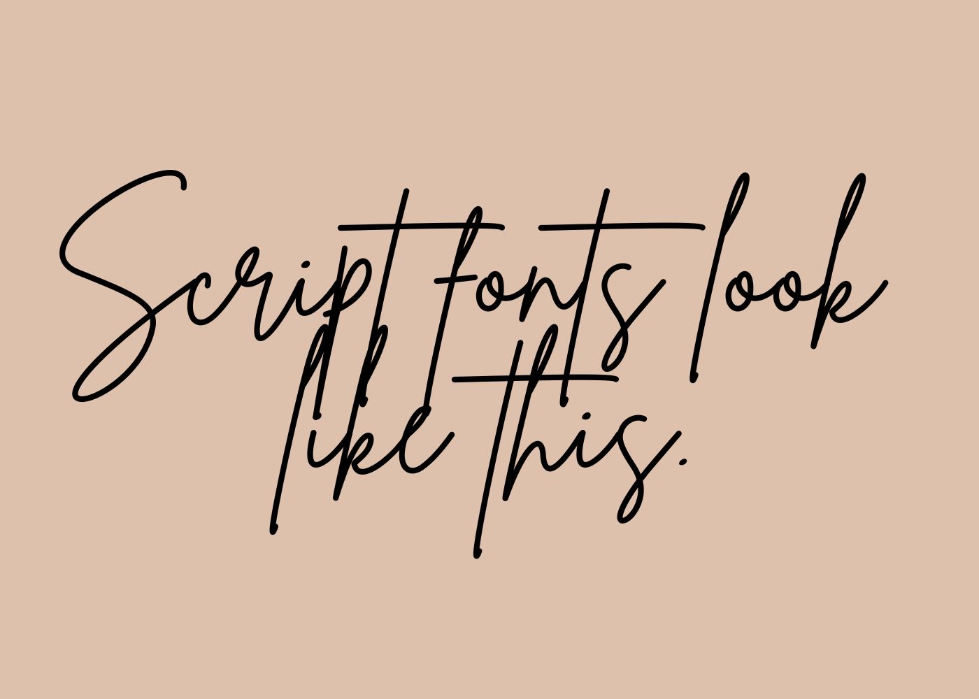
Script Fonts: Elegant & Personal
Script fonts mimic handwriting and bring a personal, elegant, or even whimsical touch. These fonts work well for artisanal or handmade products, where the brand wants to express craftsmanship and individuality. However, script fonts can be tricky. If they’re hard to read, they might cause confusion or slow down decision-making. Our tip: keep it legible.
Choosing a font for your packaging should align with your brand message and the feelings you want to evoke in your customers. A bold, powerful font will inspire confidence and strength, while a softer, rounder font will feel friendly and approachable. Fonts play a pivotal role in the three powerful design elements that should be considered as part of your packaging design.
2. Colours: The Emotional Trigger
Colours evoke emotions in a way that nothing else can. When it comes to packaging, the colours you choose can have a direct impact on how a consumer feels about your product—and whether or not they buy it.
Red: Passion, Excitement, and Urgency
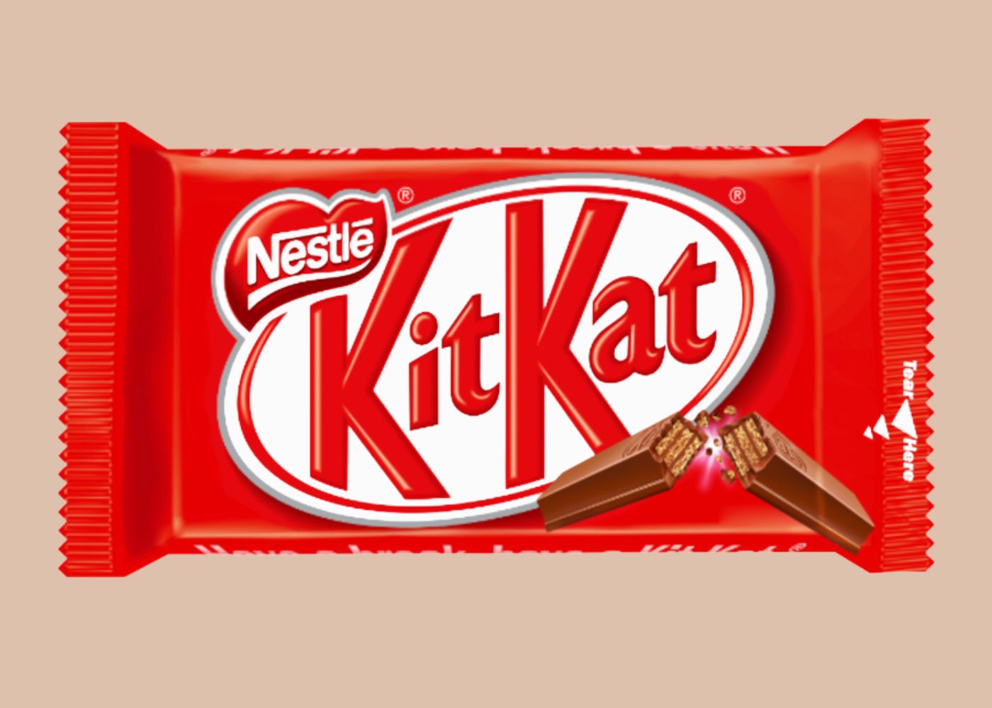
Red demands attention and elicits strong emotions like passion and urgency. Brands like Coca-Cola and KitKat use red to trigger impulse buys, creating a sense of excitement. At Nextpack, we embrace red to reflect our commitment to delivering fast, reliable solutions and meeting deadlines.
Blue: Trust, Calm, and Reliability
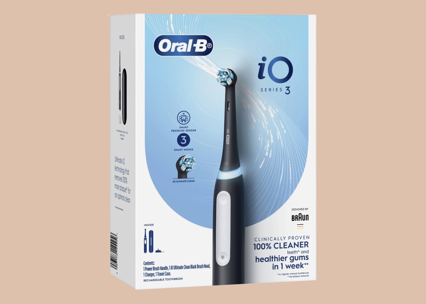
In contrast, blue symbolises trust and calmness. It is widely used in industries like healthcare, technology, and finance. Brands such as Oral-B and Ford utilise blue to convey professionalism and reliability. At Nextpack, we incorporate blue into our branding to reinforce our position as a trusted partner in product and packaging design.
Green: Nature, Health, and Freshness
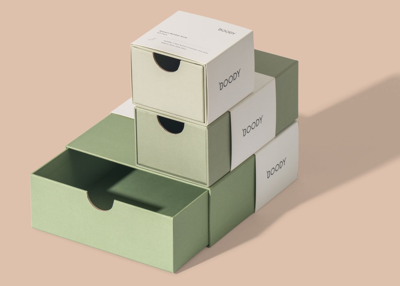
Green represents nature, health, and sustainability. Thus, it’s the colour of choice for brands that focus on eco-friendly products or natural ingredients. For example, our client Boody uses green to emphasise their commitment to nature and well-being. This colour appeals to consumers who are environmentally conscious or health focused.
Black: Luxury, Power, and Sophistication
Finally, black is bold and sophisticated, often found in luxury packaging for high-end products like perfumes and watches. Brands like Chanel and Louis Vuitton leverage black to create an aura of exclusivity and sophistication, making consumers feel special.
Each colour triggers a different emotion and consumer response. At Nextpack, whilst we’re not a branding agency, we understand the power of colour in packaging design very well. We always recommend using complementary colours to enhance your brand’s tone and evoke the right emotions in your audience.
3. Textures: The Power of Touch
Beyond fonts and colours, there’s another important sensory element that has a direct impact on consumer decisions in packaging design: texture. Packaging design isn’t just something we see—it’s also something we touch. The tactile experience of packaging can influence consumer perception and purchase likelihood.
Smooth and Sleek
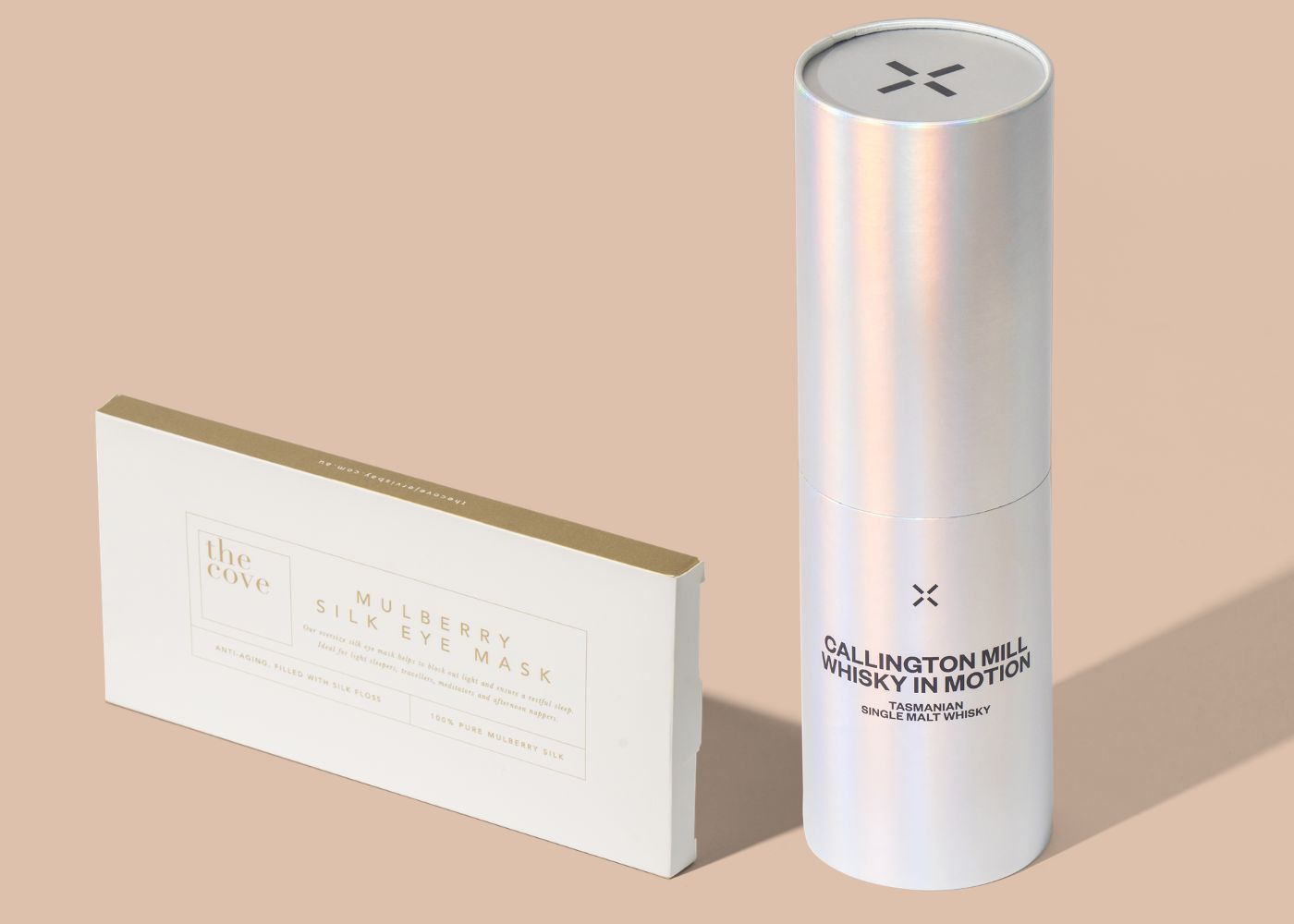
A glossy or smooth texture can give the impression of luxury, cleanliness, or modernity. Beauty and skincare products often use sleek packaging to reflect the smooth, flawless results their products promise. A high-gloss finish communicates a premium quality that makes consumers feel like they’re buying something luxurious, shiny and new.
Matte and Soft-Touch
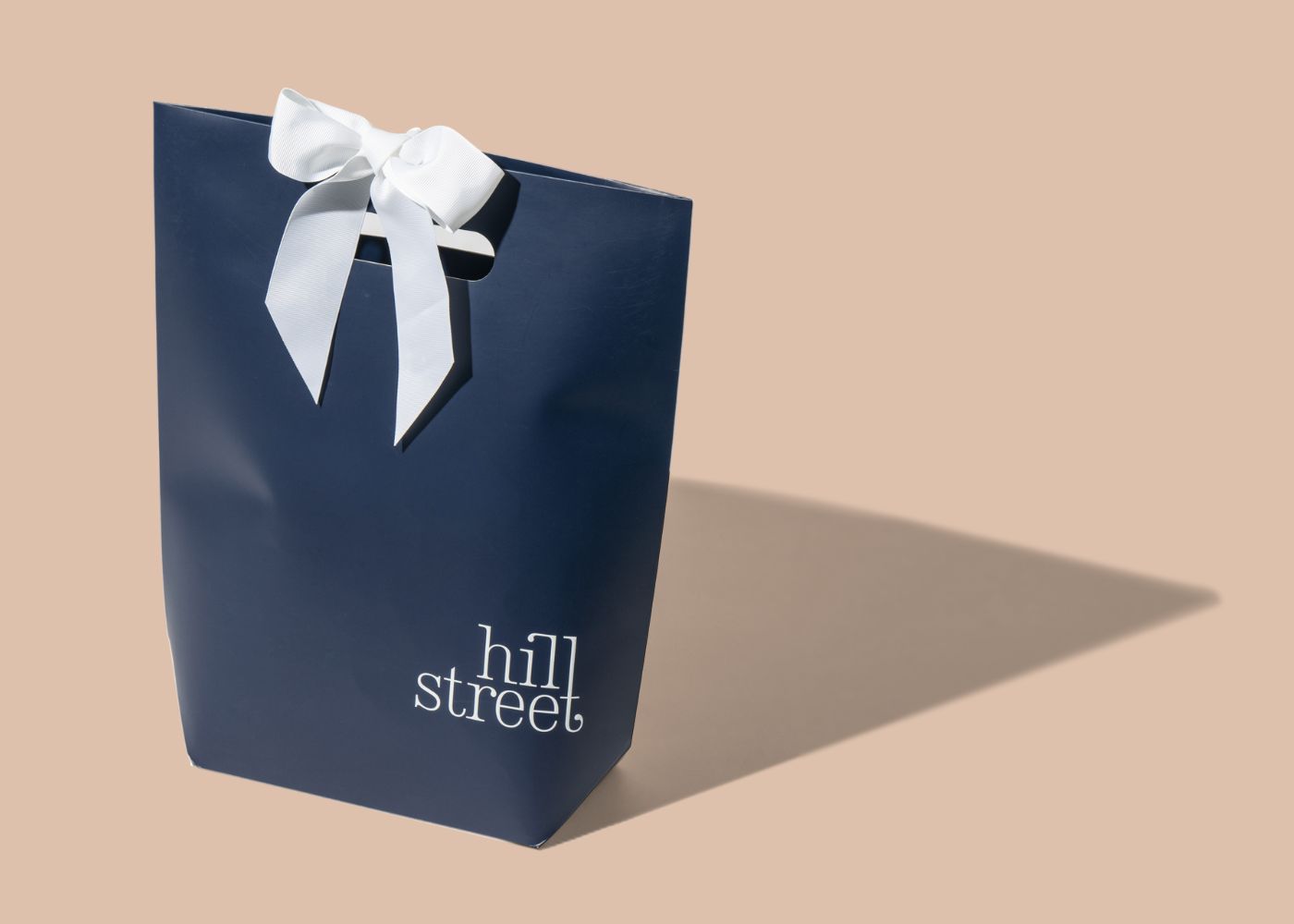
Matte or soft-touch packaging feels warm and inviting, with the grip of a matte finish being quite more-ish to touch where you just want to keep touching and feeling the product. This is often used for products that want to convey a sense of simplicity, safety, or authenticity. A soft-touch coating invites the consumer to pick it up and hold it, adding to the perceived value of the product.
Textured and Embossed
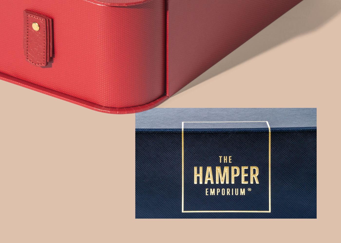
Adding texture through embossing or debossing can make a product stand out, both visually and physically. Furthermore, these raised or recessed textures provide a tactile element that makes packaging more interactive and engaging. This is a popular choice for artisanal products, wine bottles, or premium chocolates, where the packaging adds an extra layer of sophistication and detail. Sagitine’s Milan Shoe Box in Cherry showcases how this textured finishing has been used to create an elegant and functional storage solution. The Hamper Emporium’s folding gift box is also a great example where this box has a textured surface paper with a foiled and raised embossed logo. You can learn more about how we created this beautiful Anti-Scratch box here.
Conclusion
Why It All Matters
At Nextpack, we know that packaging goes beyond just functionality — it’s a powerful tool for expressing your brand’s identity, values, and quality. The right mix of these three powerful design elements — fonts, colours, and textures influences consumer perception and buying decisions.
In today’s competitive market, it’s not enough for your packaging to simply look good — it has to feel good too. Creating a tactile experience, combined with thoughtful design choices, can set your brand apart and turn first-time buyers into loyal customers.
Nextpack has over 20 years of experience designing and delivering premium packaging solutions that help brands across Australia and the world connect with their customers in meaningful ways. Whether you’re looking to refresh your packaging, add a tactile element, or create a whole new design, we’re here to help you stand out on the shelf and drive results.
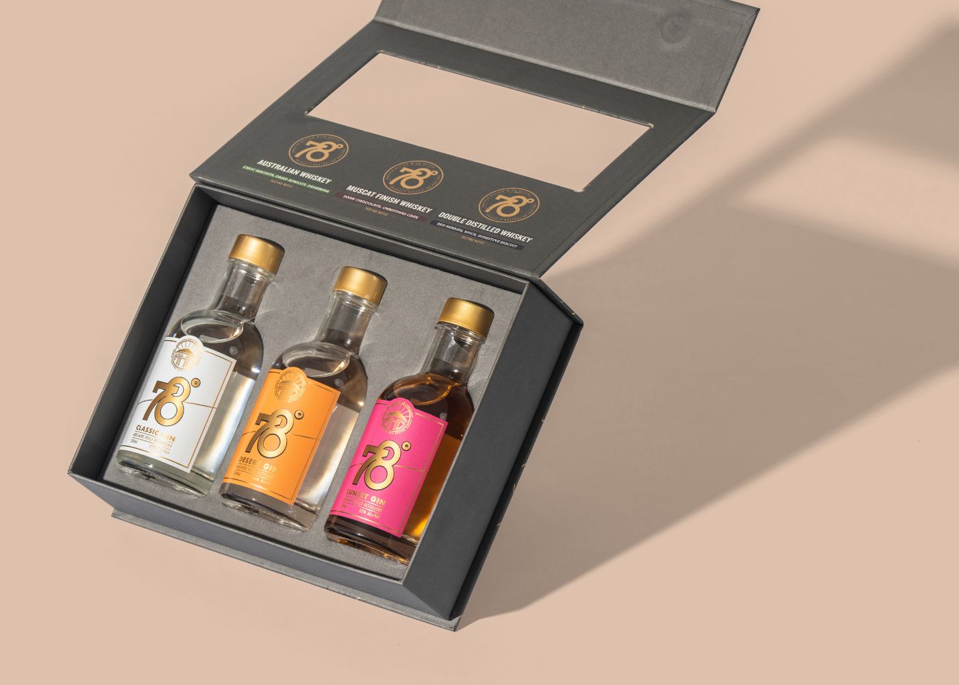
If you are ready to give your products the platform they deserve to shine on shelves, reach out to us. We’ll have them sitting pretty in no time at all just like our friends at 78 degrees whisky.